
Hello, World
2026 September 8
This is the first post written in Typst and compiled straight to HTML for the site. It has enough sections that an outline is actually useful:
Math, code, and figures#1
Typst makes it easy to mix prose with things that are normally awkward in plain HTML or Markdown, like inline math .
Equations#1.1
A display equation — which, like everything else here, can have a caption too:
Code listings#1.2
Source code listings come with syntax highlighting out of the box, and — like figures — they can have a caption:
fn fibonacci(n: u64) -> u64 {
    match n {
        0 => 0,
        1 => 1,
        _ => fibonacci(n - 1) + fibonacci(n - 2),
    }
}Illustrations#1.3
And figures with captions:

Typographic features#2
Typst covers most of the usual text-level markup.
Emphasis and decoration#2.1
Bold, italic, and even bold italic together. There’s also strikethrough, underlined text, and highlighted text for calling something out.
Scripts and small caps#2.2
Chemical formulae need subscripts, like water, H2O, and math needs superscripts, like E = mc2. Small caps are handy for acronyms and stylized headers.
Links and quotes#2.3
Prose often needs a hyperlink to point elsewhere, or a blockquote to set a quotation apart from the surrounding text:
A blockquote looks visually distinct from regular paragraphs, usually with an indent or a border.
— Some Author
Lists#2.4
Lists come in both flavors, and can nest:
- Unordered items
Can be nested:
- Like this
- And this
- Back to the top level
- Ordered items
- Count themselves
- Automatically
Tables#2.5
Tables work too:
| Markup | Renders as | Notes |
|---|---|---|
*bold* | bold | |
_italic_ | italic | |
`code` | code | Shrunk to match body text visually |
Longer-form writing#3
Most of what’s demonstrated above is deliberately terse — a sentence or two just to show a feature working. Real writing rarely stays that compact for long, though, and a typographic system only proves itself once it’s carrying actual weight [1]: paragraphs that run for several sentences, ideas that need room to develop, and the kind of digressions a shorter demo never has space for. This section exists mostly to give the layout something more substantial to hold, so it’s worth reading with an eye toward the column width, the line spacing, and how a long block of text sits against everything else on the page.
There’s a particular tension in designing for long-form prose on the web: too narrow a column and the eye tires from wrapping every few words; too wide and it loses the horizontal tracking that makes a line easy to follow back to its start. The usual advice settles somewhere around sixty to seventy-five characters per line1, which is exactly the kind of number that sounds precise until you actually sit down and read something set at it. It’s less a hard rule than a starting point — the right width also depends on the type size, the line height, and even the specific letterforms doing the work, since a heavier or wider face reads comfortably at a narrower measure than a light, condensed one would.
A quieter kind of testing#3.1
None of this is really about the words themselves. It’s about whether a reader can drop into a long paragraph without noticing the mechanics underneath it — the width of the margin, the color of the muted text, the exact weight of a heading relative to the body copy beneath it. Those things are supposed to disappear2. If they do, the paragraph did its job; if a reader instead notices the page fighting them, that’s usually a sign something in the measure or the rhythm needs another pass.
A remotely-hosted illustration#4
Not every illustration needs to live inside the compiled post itself. image() above always gets inlined as base64, which is fine for a small SVG but starts to add real weight once a picture is an actual photograph. The alternative is Typst’s html.elem escape hatch, which emits a plain HTML element instead of going through Typst’s own image-embedding pipeline — so the src stays a real URL, and the browser fetches (and caches) it as an ordinary image request rather than it being baked into every visitor’s page load:
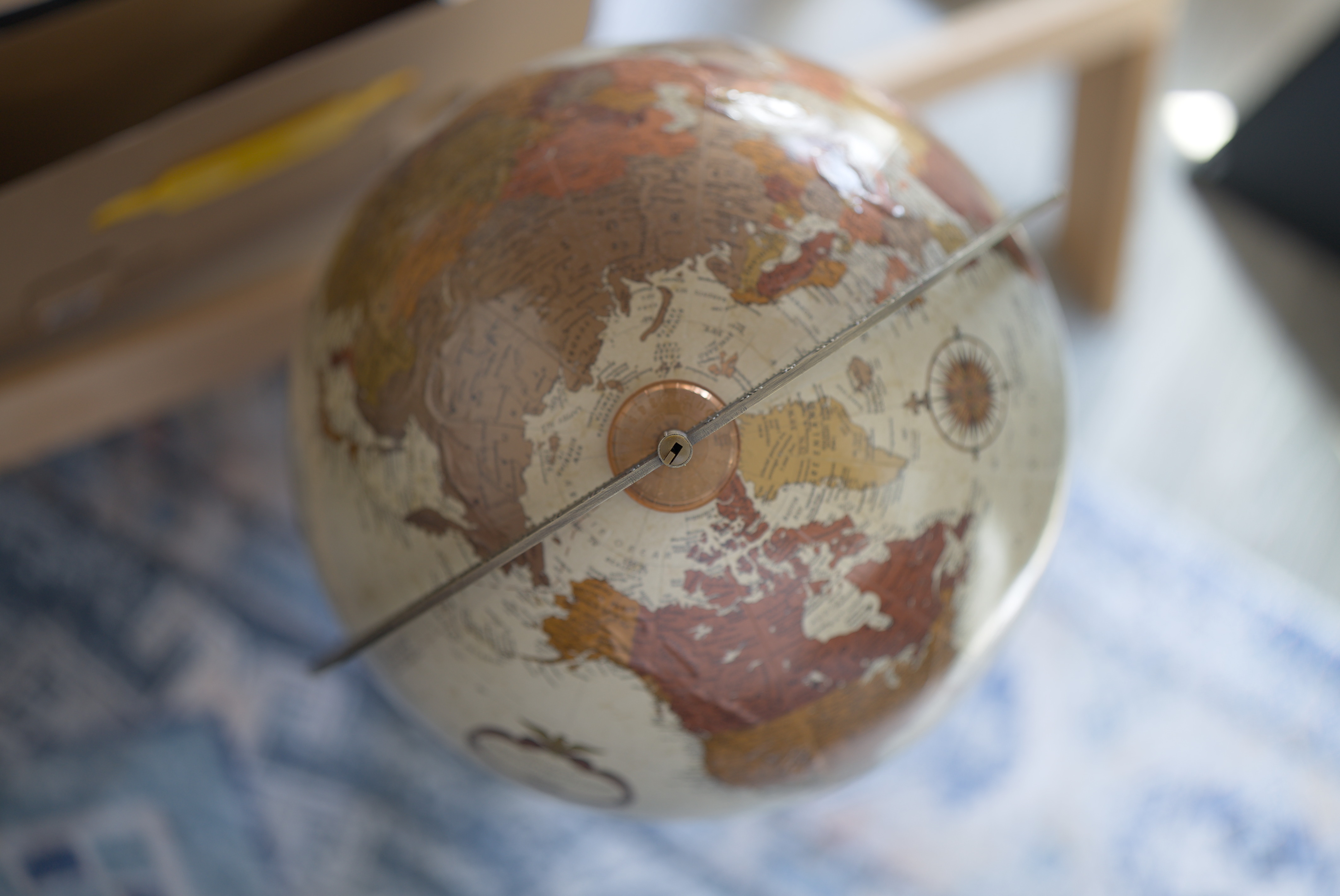
Whether that trade-off is worth it depends on the image: a tiny icon or diagram is small enough that inlining it barely matters, and keeps the post fully self-contained in one file with nothing else to manage. A larger photograph is the opposite case — inlining it bloats the HTML itself, while linking it out keeps the page light and lets the browser (and any CDN in front of it) cache the image independently of the post that happens to reference it.
Wrapping up#5
More posts can live alongside this one in content/writing/.
Bibliography
- [1] R. Bringhurst, The Elements of Typographic Style. Hartley & Marks, 2004.
- 1Robert Bringhurst’s The Elements of Typographic Style is the usual reference point for this range — though like most typographic advice, it reads more like a starting point than a rule once you actually try to apply it.
- 2The usual way this gets put: good typesetting is invisible — you only notice it when it’s done badly.